8/28/2026
tl;dr: this is my first time writing for fun and I thought I would connect it to my thoughts/decision making of redesigning my website. I also have a large backlog of other writing ideas that will provide more value (imo).
how did we get here?
I have rebuilt my personal website five times in twoish weeks. none of these rebuilds were necessary. all of them were necessary. let me explain.
my site currently lives as a column of lowercase text with a picture of my cat in it. getting there took a stock photo of a Lay’s chips bag, three spinning record players, a font made out of my own handwriting, and an embarrassing number of commits.
this is the step-by-step, with receipts, because I kept patch notes the whole time like the website was a competitive video game receiving balance updates (it was. the enemy team was me.).
I have never studied design. I just thought it would be cool to share how I made the choices I did, what I paid attention to, and which people gave me ideas along the way. A lot of the inspiration came from friends and/or people whose taste I admired s/o @soggyburritowu and @992rodney
the OG
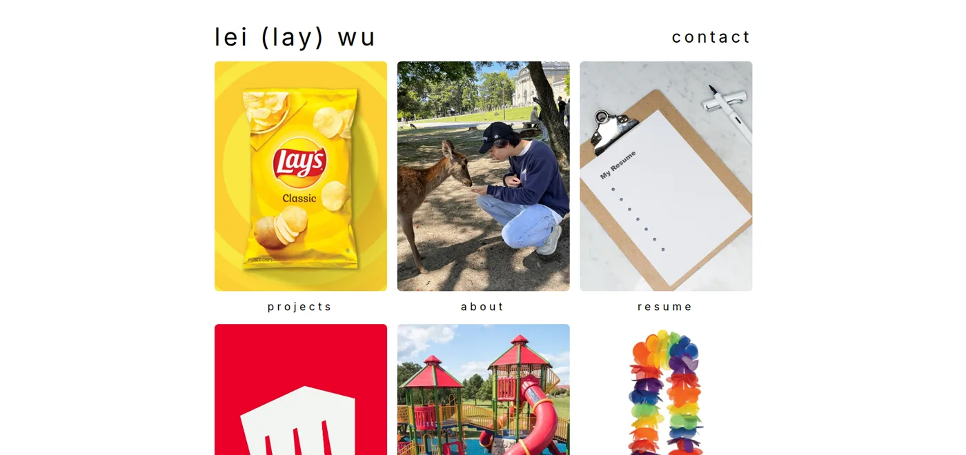
the original site: a white page with a photo grid. the projects tile was a bag of chips. it was originally made without AI tools but eventually tidied up with them. I finally got fed up and redesigned it because it was paining my taste buds.
the first iteration
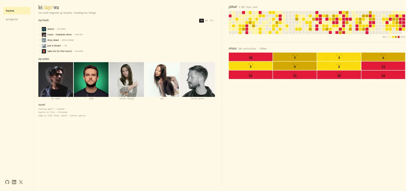
so I started last week with some inspiration from my friends and people whose taste I admired.
originally I had this really good (bad?) idea in trying to make my website entirely dashboards of my life. I was going to include my live heart rate on it (WIP) through the google health api and a fitbit.
it would’ve basically been my life as a bento box. I basically restarted the codebase from zero, keeping only my media files and fun projects to be reused.
the second iteration
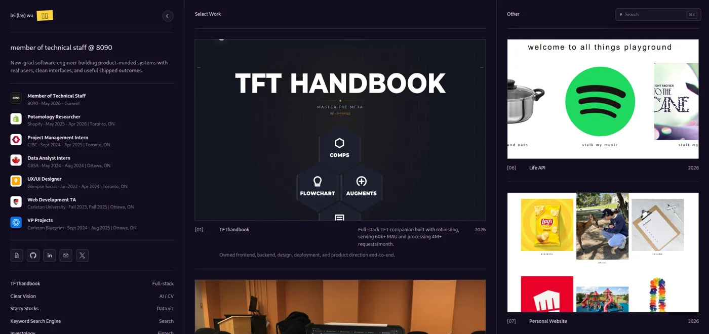
the site got serious.
dark theme, three columns: an experience timeline with real company logos on the left, a “select work” showcase in the middle, a playground and a ⌘k command palette to search on the right.
this was also when I decided that I wanted to have a plan for the whole redesign.
the third iteration
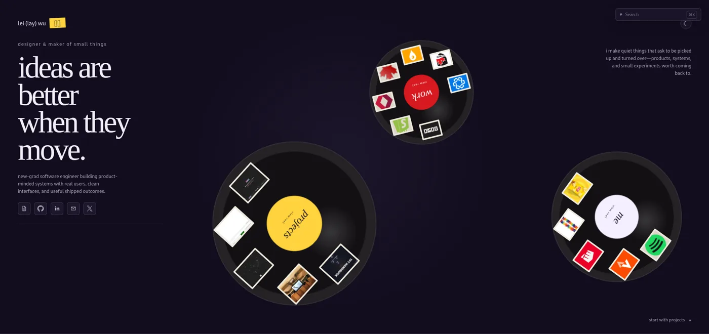
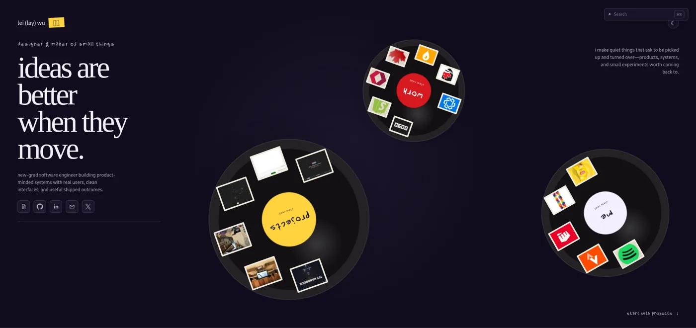
the record spinning idea was whatever, I built it out and it seemed too complex and not intuitive enough for users to navigate.
this redesign opened with a giant serif hero that read “ideas are better when they move.” under it were three spinning records: a red one for work, a yellow one for projects, a white one for me, each loaded with little photo slides.
it had theme-aware loading sounds, it had a search bar. and it was the most impressive thing I’ve ever built for recruiters who spend 5 seconds on the page.
the final copy
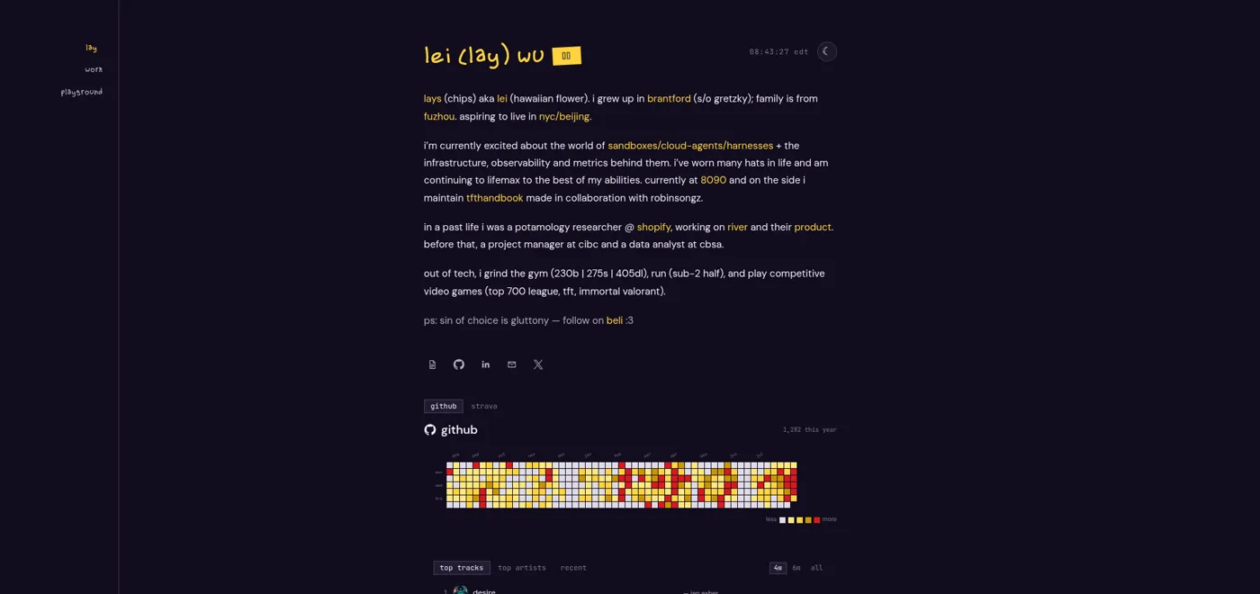
I archived the whole thing. I loaded up @992rodney’s portfolio and really loved the simple leiout.
the 3.0.0 patch notes say it plainly: rebuilt “as a text-first single column, in the spirit of the small personal sites I keep coming back to.” that’s the honest part.
the sites I actually revisit aren’t the impressive ones. they’re the ones where a person just talks to you, it’s easy to read, digest, and a bit humourous.
so the reels went into the archive, and the homepage became a bio. the widgets survived but got folded into little tabs.
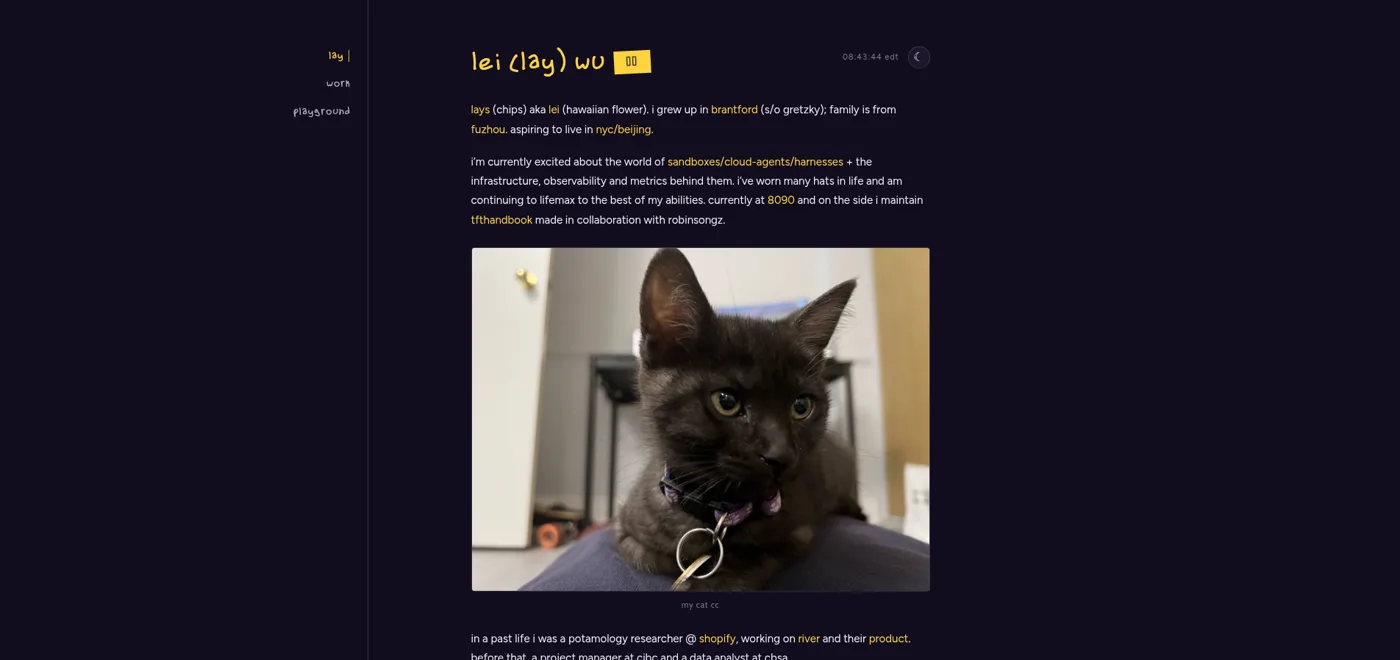
the current version, 3.1.0, is mostly typography plus a cat. her name is cc. she gets a caption :3
oh, and it was also here where I decided that I wanted to switch my hosting from firebase to cloudflare. I realized for a static page there was no reason to be serving it from firebase, which has limits, as opposed to something like cloudflare, which has a friendly free tier.
things I paid attention to
even after choosing a simple layout, I spent a lot of time on the small details.
custom, cool, & complementary fonts
I even built a font. lont is my own handwriting, digitized and landed on the accent text, so “designer & maker of small things” is written the way I’d write it on a sticky note. I’ve also come to realize my handwriting lowkirkenuinely looks like comic sans.
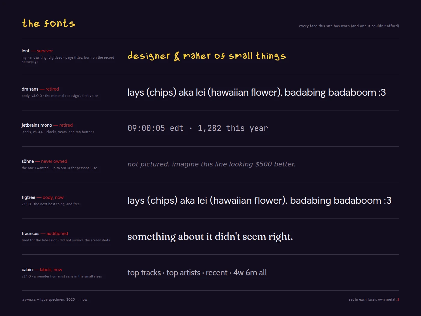
choosing the rest of the fonts was t u f f TUFF. I originally wanted to go with söhne (NYC subway font), but that font costs up to $500 for personal use and I didn’t want to pay all that. so I went into the rabbit hole of looking and found that figtree was the next best thing.
then I learned about complementary fonts and had to find the best for figtree. I had originally gone with fraunces, but something about it didn’t seem right, so I tested and played around until I found cabin.
figtree now carries the reading and cabin handles the little labels. and as I’m writing this I want to change the font from cabin to bookmania (but it also has the same problem as söhne: it needs to be paid for. new york or nowhere font).
colour choices (cc)
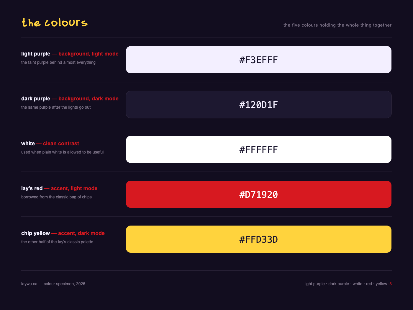
some design decisions from the serious portfolio carried into the final versions: the colours. my favourite colour is purple, but I knew I wanted to have both a light and dark mode, so I used a super faint light purple and a deep dark purple.
I also decided that the text would be in the same colours as the lay’s classic brand kit, borrowing their yellow, red, and white to acknowledge the chips within my website.
social cards
I also had to think about what the website looked like when it wasn’t open (it’s kind of like a business card).
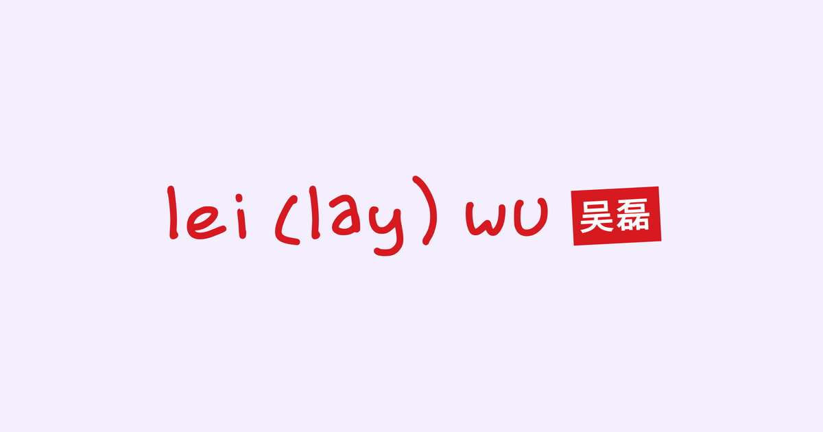
the first social card copied the website almost exactly: the handwritten name, the 吴磊 chip, the navigation rail, and the start of my bio.
then I removed almost all of it. the final card is just my name and the red name chip on the light purple background.
classic example of less is more.
once again the social card is important for when the link is being sent (it’s the first thing people see before they even load into ur website)
loading animation & name card
around this time is when I had decided that making an intro/loading animation would be really cool. and really cool it was as I received feedback in the form of engagement. I got the original idea from @soggyburritowu on X, who had an animated intro. I also stole her name card flow (we share a last name :P)
the majority of the process of making the animation was through osmo studio and claude going back and forth until it got it done pretty well. I made slightly different loading animations for the light and dark themes based on the user’s system settings. the page-reload sound effect went through six speed changes before I decided on one that felt right.
keeping it simple (stupid)
i couldn’t just copy @992rodney’s website entirely; i had to give it my own twist and make it original. the portfolio is supposed to be personal.
the 42rem column is intentionally almost boring. super straightforward, no cards fighting for attention, and room for the writing to sound like me. with ai, so many things have gotten overly complex and noisy. I found that simple designs are better (less is more!).
writing, memes, shits & giggles
the load-bearing tile on the original website was “website patch notes” behind a riot games logo. I started writing changelog entries for my personal website the way riot writes patch notes for league: version numbers, dated entries, “the inaugural patch.” v1.0 shipped july 27, 2025, and the entry admits I’d already missed the first two years of changes. this habit outlived every design in this post.
eventually some thoughts got too long for a patch note, which is how the writing page got here. the playground also became the pleiground because lei was sitting right there and I could not leave the pun unused. the old links still redirect though just in case (backward compatibility!)
I spent a great amount of time thinking about how to write out what I want to present out to the world, what cool things about me to include, while still letting the website work as a portfolio for my online self.
I also wanted to embrace my humour in my writing, with just the way I like to articulate. examples being how I like to have mostly everything lowercase (except for solo I’s and A’s), how I use :>, :3, :p, etc., and name puns like pleiground, leiter, leiout.
glhf
your personal website doesn’t need to be impressive. mine was, briefly, and I deleted it. it needs to be yours. for me that turned out to mean lowercase, name puns, patch notes like it’s a video game, and a cat.
redesign it whenever you want. you don’t need a reason. the website is never done, and that’s not a bug in the process. every version in this post was “the final design” while I was building it. the only thing that actually persisted across all five is the changelog.